ShopEase — E-commerce App
Shop More. Live Easier.
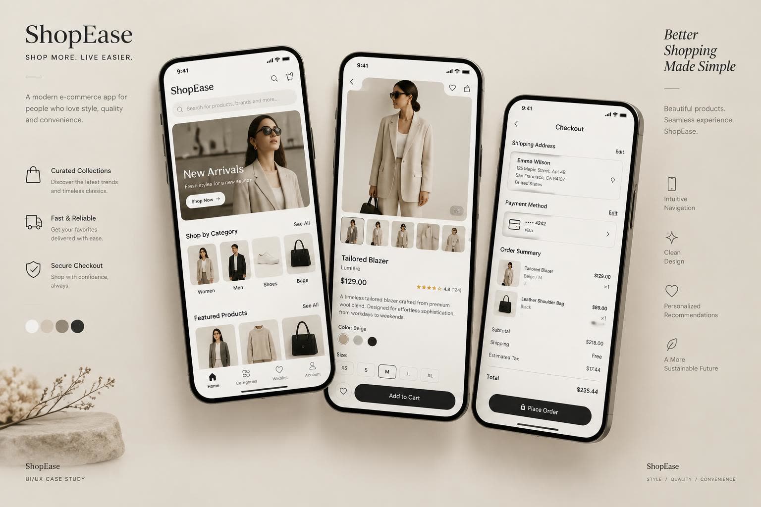
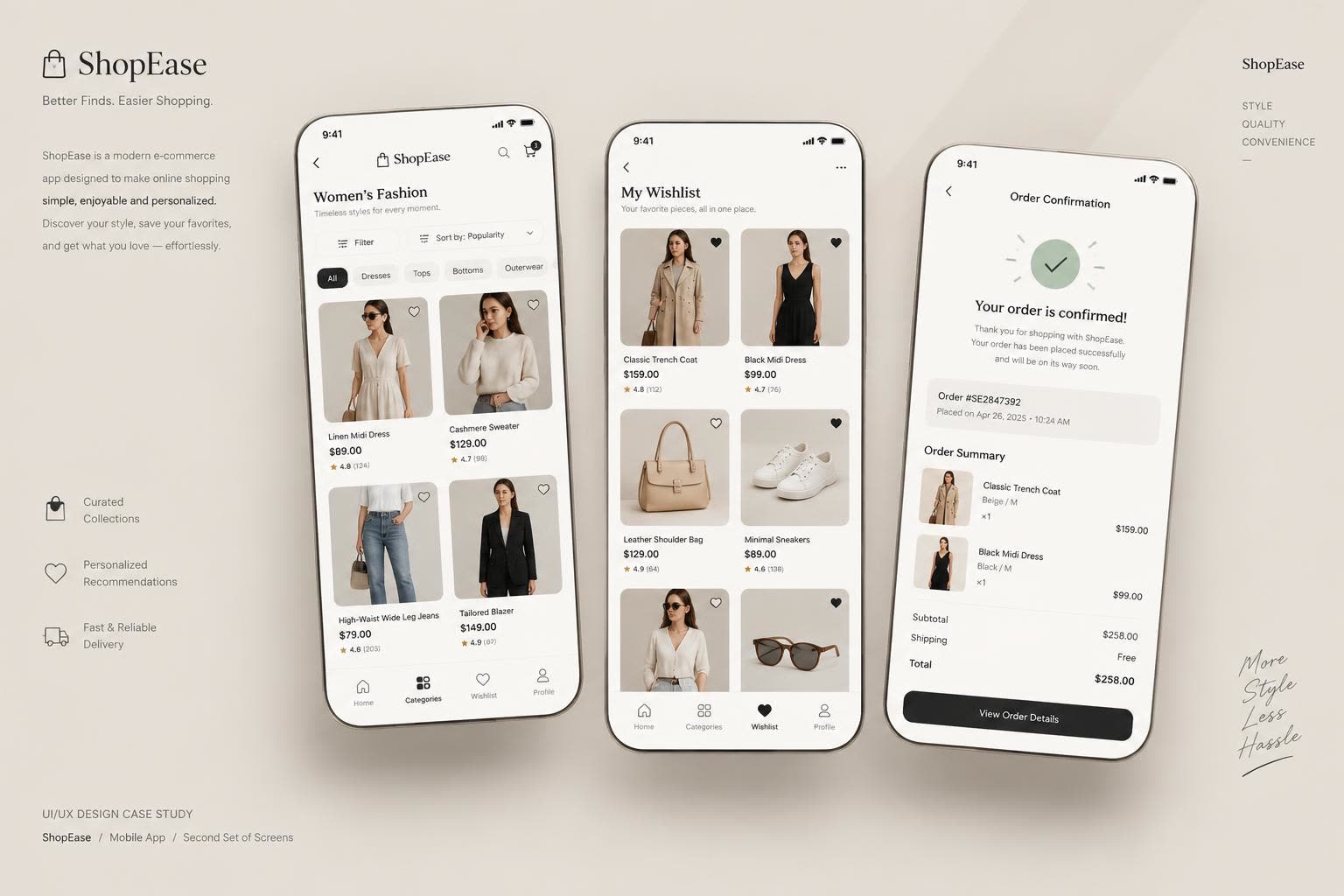
ShopEase is a concept for a polished shopping app built around strong product imagery and generous spacing. It covers the full purchase journey: a home screen with new arrivals and categories, product listing with filters and sorting, product details with an image gallery, wishlist and cart, and a calm, confidence-building checkout with order confirmation.
What this design sets out to do
- Let products sell themselves — photography first, interface second.
- Make browsing effortless with clear categories, filters and sorting.
- Build a checkout that feels safe: address, payment and summary on one calm screen.
- Keep the neutral palette premium and timeless rather than trendy.
Who it's designed for
Style-conscious shoppers
Browse new arrivals and collections visually — imagery and curation matter more than specs.
Deliberate researchers
Compare, filter, read details and save to a wishlist before committing to a purchase.
Returning customers
Want reordering, order history and saved addresses to make repeat purchases frictionless.
The screens, end to end
Key flows from the concept, presented as coordinated design boards.
Colors that carry the brand
Ink Black
#1A1815
Warm Beige
#EDE6DB
Stone Grey
#B8AEA0
Surface White
#FFFFFF
Soft Taupe
#D8CFC2
Success Sage
#7D9B76
Type that stays out of the way
Inter
Aa Bb Cc Dd Ee Ff Gg · 0123456789
A refined sans with wide letter-spacing for labels and prices, paired with generous line-height in descriptions. The restraint in type mirrors the restraint in color.
Why it works the way it does
Gallery-first product details
The image gallery takes the top half of the screen with thumbnail strip and page indicator — in fashion e-commerce, the photo is the decision.
Filters as chips, not a hidden panel
Category chips and a visible sort control sit directly above the listing, so refining results never feels like leaving the page.
One-screen checkout
Shipping address, payment method and order summary live on a single scrollable screen with edit actions — fewer steps, fewer drop-offs.
Confirmation that closes the loop
The order confirmation shows the order number, timestamp and full item summary immediately, so users never need to check email to feel sure.
UI/UX Design Concept · Created to demonstrate design skills · Not a client project