Foodie — Food Ordering App
Good Food. Great Mood.
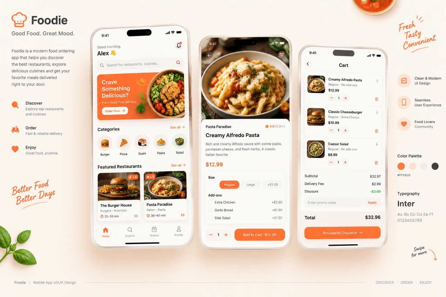
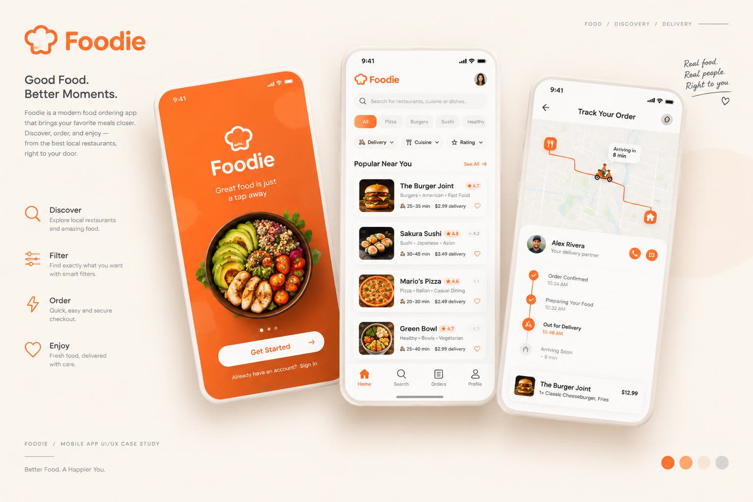
Foodie is a concept for a modern food ordering app that helps people discover restaurants, explore cuisines and get meals delivered — with as few taps as possible. The design covers the full journey: splash and onboarding, home with categories and featured restaurants, search and listing, food details, cart and checkout, and live order tracking.
What this design sets out to do
- Make ordering feel fast — from opening the app to checkout in under a minute.
- Let food photography lead: big, appetizing imagery on every key screen.
- Keep one clear primary action per screen, always in the warm orange accent.
- Build trust at checkout with transparent pricing and a live order timeline.
Who it's designed for
Busy professionals
Order lunch between meetings — they need speed, reordering and reliable delivery estimates.
Students and young adults
Price-conscious explorers who browse categories, use filters and hunt for deals.
Families ordering dinner
Larger carts with add-ons and special instructions — clarity in the cart matters most.
The screens, end to end
Key flows from the concept, presented as coordinated design boards.
Colors that carry the brand
Primary Orange
#FF6B35
Warm Cream
#FFF4EC
Soft Peach
#FFD9C2
Charcoal Text
#2B2118
Success Green
#3BB273
Surface White
#FFFFFF
Type that stays out of the way
Inter
Aa Bb Cc Dd Ee Ff Gg · 0123456789
A single geometric sans family across the app — bold weights for dish names and prices, regular for descriptions. One family keeps the UI calm and lets the food photography carry the personality.
Why it works the way it does
Bottom navigation with four tabs
Home, Explore, Orders and Profile cover every task without a hamburger menu — everything is one tap away and the cart lives inside the ordering flow.
Orange reserved for actions
The warm orange appears only on buttons, active states and key prices, so the eye always knows where to tap next.
Price breakdown before checkout
Subtotal, delivery fee and discount are itemised in the cart — no surprises at the last step, which is where most food apps lose orders.
Tracking as a timeline, not a map alone
Order confirmed → preparing → out for delivery → arriving, with timestamps. The map supports the timeline instead of replacing it, so status is clear even at a glance.
UI/UX Design Concept · Created to demonstrate design skills · Not a client project